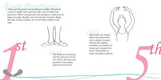
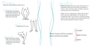
 This is the cover of my how to book. I printed the cover on vellum and then placed a piece of paper with a pattern on it under the sheet of vellum. I used ribbon to tie the book together. The blue lines on the cover and every page of the book mimic the ribbon.
Tuesday, June 8, 2010
Monday, June 7, 2010

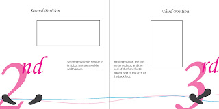
 These are two of the spreads for my how to book. The first page of the book is an introduction. Then there is one page for each of the five foot positions in ballet, and one page for each of the arm positions in ballet. The last page has lists some ballet terms. Each position and terms has an illustration demonstrating it. The pages with the foot positions also has "footprints" in the corner of the page for a better understanding of where the feet should go.
Tuesday, May 25, 2010
How to Book

My how to book will be about how to dance. It will focus on ballet. I will include the five basic foot positions, and the five basic arm positions. The first page will have an introduction and what one will need to do ballet. At the end of the book, there will be a page that will explain how to do a few basic ballet moves. The layout of the pages with the foot and arm positions will be similar to the layout at the left. There will be a description of how to do each and there will be a drawing. The colors I will use in the book are light pinks and blues.
Thursday, May 13, 2010
Slice of Cake Stickers
Tuesday, May 11, 2010
Slice of Cake Logo

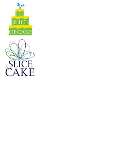
For The Slice of Cake identity my team wanted to create something that is fun, whimsical and colorful. We chose to use greens blues and purples. The top logo was our first attempt, but each line ended with an "E" and the text is all around the same size. We decided to go away from the idea of cake for the logo, and to make the word of smaller than the words slice and cake. We noticed that Jen used a bow to top a lot of her cakes, so we decided to use the bow in the logo. The bottom logo is the final design we came up with, the tag line will go below the word cake.
Subscribe to:
Comments (Atom)


