Thursday, April 29, 2010


This is page 3 of the newsletter. I keep the same elliptical shape for the graphics as I did on page 1. I wanted to keep the layout for each page consistent, but have variety within the layout.
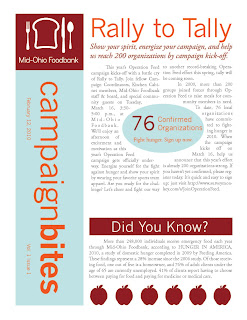
This is page 2 of the Mid-Ohio Foodbank newsletter. The key campaign dates replace the nameplate on the left side of the page.

This is the final layout for the Mid-Ohio Foodbank newsletter. I placed the graphic for the article in the center of the text to break up the text. Each page of the newsletter has on article at the top of the page, which will change from week to week. One of each of the three sections that will be in every newsletter, Did You Know, Shelf Life and Recipe for Sucess, are at the bottom of each page.

I will be using images of apples throughout the Mid-Ohio Foodbank newsletter. I wanted to have some imagery that would stay consistent with the article from week to week. I thought about doing cutouts of some kind of food, and when looking on the Mid-Ohio Foodbank website, I notice they had cutouts of apples on one of the pages. I decided to stick with images already associated with the foodbabank. I made my own apples to be placed at the bottom of the newsletter, and made them the same dark red color as the backgound behind the logo.

This is the nameplate that I designed for the Mid-Ohio Foodbank. It will be placed on the left side of the first page. I chose to turn the title of the newsletter, because it is different, and I felt the logo should be the first thing the viewer looks at. By placing the title on the side gives space to put an article title at the very top of the page, which directs the viewer to what is important in the newsletter.

Sunday, April 25, 2010

Mid-Ohio Foodbank Newsletter

For the Mid-Ohio Foodbank newsletter, I will make the layout into three columns, and the background will be white, to make the newsletter easier to read. The logo will be placed in the top left corner with a dark red box around, with the logo in white. The nameplate will be placed along the left side of the page with the text turned sideways with a light blue box around it. The title of the most important article will be at the top of the page. Placing the nameplate at the side, and the title of the article at the top keeps the newsletter focused, and the viewer is directed to what is important. When the newsletter is sent by email, the first thing seen by the reader will be the Mid-Ohio Foodbank logo and the title of the first article. The font that I will be using for the body copy is Adobe Garamond Pro, and I will be using News Gothic MT for the nameplate. The body copy will be the same dark red color that will be place around the logo.
Tuesday, April 13, 2010

ad campaign final


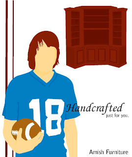
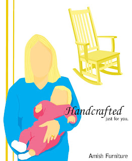
This is the layout that I decided to go with for the ads. I wanted to emphasize the person's hair color, and the aspect of their personality that connects them to the furniture, since the furniture is "Handcrafted just for you. To accomplish this, I placed the person in the bottom left corner of the page, and made it the largest image on the page. I placed the piece of furniture in the top right corner of the page, and it is smaller than the person. I placed the lines at the side of the page to fill the empty space in the top right corner of the page, and I made them a shade darker than the hair color to help emphasize the hair color. I chose the font for the word handcrafted, because it looked like handwriting, which plays off of being handcrafted. I made the word handcrafted bigger to emphasize that the furniture is handcrafted. I made "just for you" smaller and placed it below the would handcrafted , so the viewer would see handcrafted first, pause after reading it and then see just for you. Amish Furniture is placed at the bottom right corner of the page below the tagline, and is the same font as just for you.
Each person is holding something that also connects them to the furniture. One is a guy holding a football to represent being a football fan, and the of furniture connected with him is an entertainment center. In another ad there is a woman holding a baby and she is connected to a rocking chair. The last ad is a business woman holding a notebook, and she is placed with a desk.
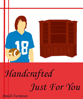
I decided to do the ads for the amish furniture. This is the first layout I came up. I do not like it because everything is the same size, and nothing is empasized. The person and the hair color should be what is emphasized. The font is to big and the box around the tag is distracting from the illustrations. I put the lines down the side of the ad to tie the ad together, but the color of the lines distracts from the color of the hair and the piece of furniture. I chose the font to play off of handcrafted, because it looks like handwriting.

Thursday, April 8, 2010

ad campaign thumbnails


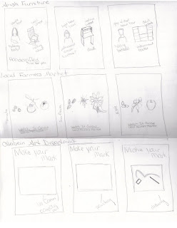
The concept that I came up with for the Amish Furniture is "Handcrafted just for you." Each ad will have a picture of a person and a piece of furniture. The piece of furniture is going to match the color of the person's hair. One ad will be a woman holding a baby, and the piece of furniture in the ad will be a rocking chair. Another, will be a woman dresses in business clothes holding a notebook, and the piece of furniture is a desk. The last ad will have a guy holding a football, and he will be wearing a football jersey. The piece of furniture in the ad will be an entertainment center. This references "Handcrafted just for you," because each piece of furniture matches the person's appearance and personality.

"Watch it grow" is the concept that I came up with for the local farmer's market. I chose this, because all of the products at the market are grown locally. Each ad will have a picture of seeds, and then a picture of a vegetable, flower or fruit after it is grown and has been picked.

For the Otterbein Art Department, the concept I came up with is "Make your mark." Each ad will have a photograph of a piece of artwork in progress, and the tools needed to make the piece. Each ad will represent a different concentration.

Sunday, April 4, 2010

Thinking Differenlty Final


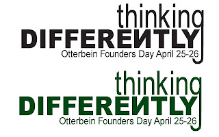
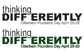
These are the two designs I have decided to send to the Founders Day Committee. In the design with the long "g," I made the word thinking bigger, because it seemed to last in the design compared to the word differently. I decided to go with the color green. Since the theme is thinking differently, I did not want to use the color red, because it is one of the school colors. Green and red are complementary colors, and green also symbolizes growth.

Friday, April 2, 2010


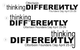
Design 1 was my first idea for the t-shirt design. The word thinking is all lowercase and in the font arial narrow, and the word differently is all uppercase and in the font arial black. This plays off the theme of thinking differently. The "N" in differently is backwards to make reference to the "N" on the Otterbein sign on towers being backwards and also makes a reference to thinking differenlty. After making the design on the computer, the word thinking felt disconnected from the rest of the design. To solve this problem i tried two things. The first was to move the word thinking on top of the word differently, design 2. I did not like how the descender of the "g" came down into the space between the two words. So, I moved the word thinking down more so the descender of the "g" is between to the "f" and "e" of differenlty to split up the word, which also plays of the thinking differenlty theme. I also tried moving the word thinking to above the end of the word differently, design 3, and making the descender longer to wrap around the design, which also plays off the theme thinking differenlty.