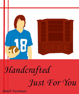
I decided to do the ads for the amish furniture. This is the first layout I came up. I do not like it because everything is the same size, and nothing is empasized. The person and the hair color should be what is emphasized. The font is to big and the box around the tag is distracting from the illustrations. I put the lines down the side of the ad to tie the ad together, but the color of the lines distracts from the color of the hair and the piece of furniture. I chose the font to play off of handcrafted, because it looks like handwriting.
No comments:
Post a Comment