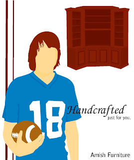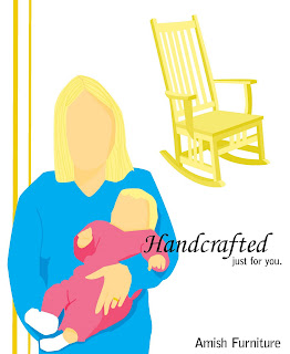
This is the layout that I decided to go with for the ads. I wanted to emphasize the person's hair color, and the aspect of their personality that connects them to the furniture, since the furniture is "Handcrafted just for you. To accomplish this, I placed the person in the bottom left corner of the page, and made it the largest image on the page. I placed the piece of furniture in the top right corner of the page, and it is smaller than the person. I placed the lines at the side of the page to fill the empty space in the top right corner of the page, and I made them a shade darker than the hair color to help emphasize the hair color. I chose the font for the word handcrafted, because it looked like handwriting, which plays off of being handcrafted. I made the word handcrafted bigger to emphasize that the furniture is handcrafted. I made "just for you" smaller and placed it below the would handcrafted , so the viewer would see handcrafted first, pause after reading it and then see just for you. Amish Furniture is placed at the bottom right corner of the page below the tagline, and is the same font as just for you.
 Each person is holding something that also connects them to the furniture. One is a guy holding a football to represent being a football fan, and the of furniture connected with him is an entertainment center. In another ad there is a woman holding a baby and she is connected to a rocking chair. The last ad is a business woman holding a notebook, and she is placed with a desk.
No comments:
Post a Comment