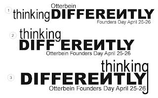
Design 1 was my first idea for the t-shirt design. The word thinking is all lowercase and in the font arial narrow, and the word differently is all uppercase and in the font arial black. This plays off the theme of thinking differently. The "N" in differently is backwards to make reference to the "N" on the Otterbein sign on towers being backwards and also makes a reference to thinking differenlty. After making the design on the computer, the word thinking felt disconnected from the rest of the design. To solve this problem i tried two things. The first was to move the word thinking on top of the word differently, design 2. I did not like how the descender of the "g" came down into the space between the two words. So, I moved the word thinking down more so the descender of the "g" is between to the "f" and "e" of differenlty to split up the word, which also plays of the thinking differenlty theme. I also tried moving the word thinking to above the end of the word differently, design 3, and making the descender longer to wrap around the design, which also plays off the theme thinking differenlty.
No comments:
Post a Comment